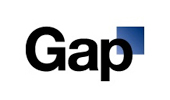
GAP Overhauls Logo Overhaul
 After much critisim and outrage, late Monday afternoon Gap released a statement online letting the world know they have reverted back to their original logo. It seems 20 years is not long enough to have the logo help sell the product.
It seems the classic brand was in need of a makeover; hence the new logo on the left. Many fans are upset over the new change and say the iconic store did not need a new logo. Brandchannel’s Abe Sauer says (it) “Looks like it cost $17 from an old Microsoft Word Clipart Gallery,” and calls it a “monstrosity.” The writer states: It “demonstrates a prototypical brand panic move. With things not going in its favor, the brand decides to change the one valuable element it has going for it.” Twitter account have recently been made in both the old logo and new logo’s name: @GapLogo and @OldGapLogo. I guess America is trying to tell the re-branding execs that the old logo had plenty of love.
I think there are a few issues going on here. One, it is a change. Not many people like change sprung on them with out any notice. (Maybe that is why Gap put up the new logo only on their website without a press release?) Second issue I have is that it is just a logo. Many people are getting upset over the tag that shows up on the back of their jeans. It wouldn’t matter if the logo was hot pink with skulls! We associate with the brand not the logo. Yes, the old logo was an iconic image, recognized everywhere. But you do not buy clothes because of the tag. We all continually shop there because of the great jeans, comfy t-shirts and khakis. I think people are forgetting that!
There have been many logo changes over the past few years. Some of which we do not even remember the original logo! Apple, BP, IBM, Walmart, Starbucks, Xerox, UPS, Procter & Gamble, and Kraft Foods. Maybe all this controversy is just the start of another social media experiment?
Leave a Reply