Loss of Olympic Spirit
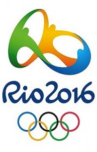
 At a New Year’s Eve party on Copacabana Beach in Rio de Janiero, the Olympic logo for the 2016 games was unveiled for the first time. After what looked like a great party to attend, came great speculation. Telluride Foundation based out of Colorado has a logo very similar to the new Rio logo. The creator of the Rio logo was Brazillian agency Tatil. The fluid motion dancers are very similar to Telluride’s. One difference being the red dancer and no legs. However, organizers say the design is supposed to represent “contagious energy, harmonious diversity, exuberant nature and Olympic spirit.”
So what steps does Telluride have in store for them? First, they are indeed the trademark owners of their mark, since they were the first to use it. However, to start an infringement lawsuit, they would need to get their logo registered. Then, they would need to prove that the International Olympic Committee’s Rio logo is confusingly similar to theirs. Quite a feat, but not impossible.
Dan Levy, a graphic designer and host of www.onthedlpodcast.com, states “These logos are way too close for my liking, even the color dispersion is nearly identical. Somebody got ripped off.”
Leave a Reply